
Typography plays a pivotal role in shaping how readers engage with text, influencing both comprehension and retention. One of the core principles in effective typography is rhythm calibration, which refers to the deliberate arrangement of typefaces, sizes, spacing, and alignment to create a visual cadence that guides the reader smoothly through content. Unlike purely aesthetic considerations, rhythm calibration is fundamentally tied to readability, impacting the ease with which a reader can scan, interpret, and internalize information. Proper rhythm in typography not only enhances visual appeal but also reduces cognitive strain, allowing readers to process information more efficiently.
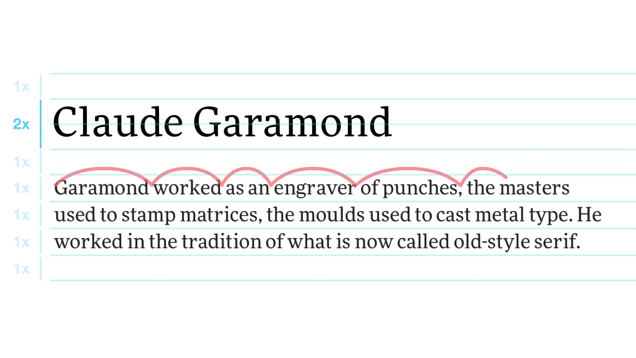
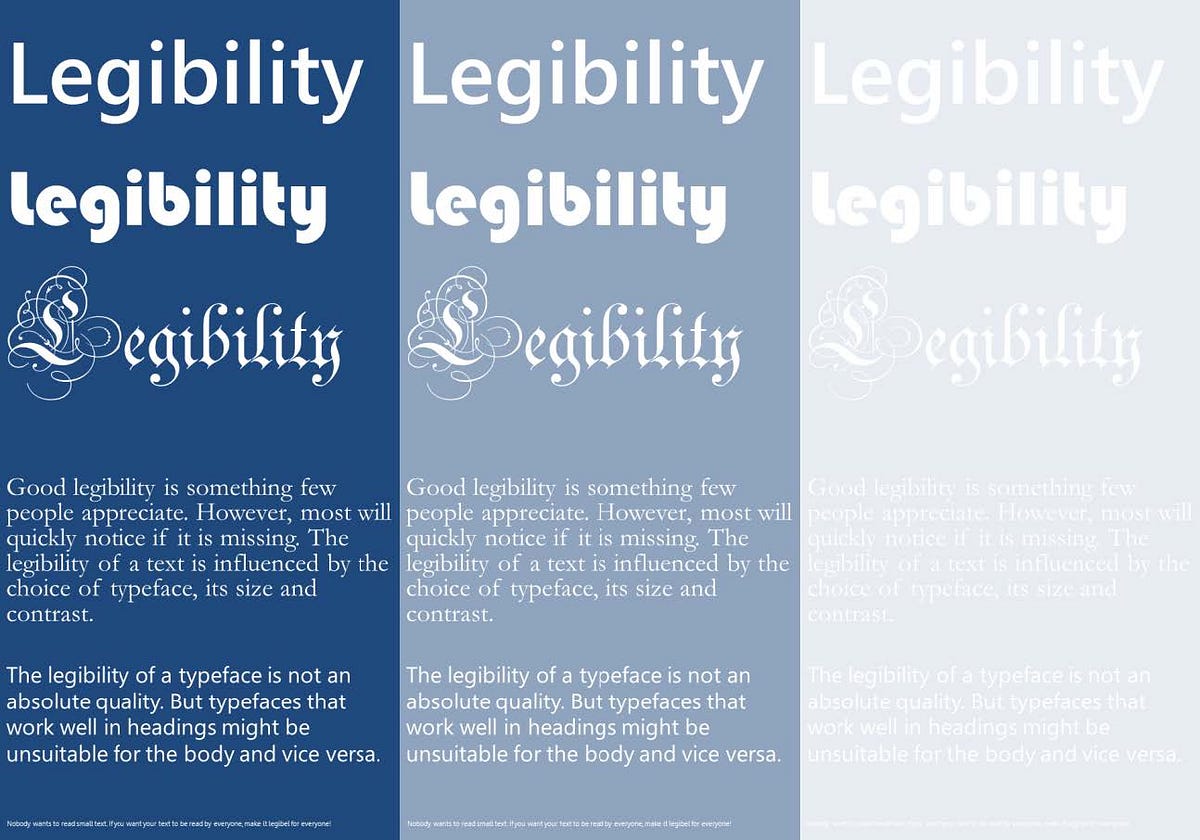
At the heart of rhythm calibration is the balance between type size, line length, and leading, the vertical space between lines of text. When these elements are harmonized, they create a predictable flow that allows the eye to move naturally from one line to the next. For instance, excessively long lines can tire the eye, causing readers to lose their place or skip lines inadvertently, while overly short lines can disrupt the reading rhythm and create a staccato effect that feels disjointed. Leading plays an equally crucial role; insufficient leading can make text feel cramped, whereas generous leading can encourage relaxed reading, improving comprehension. Optimal rhythm considers both the physical properties of the text and the context in which it is read, including device type and screen resolution, ensuring accessibility across diverse platforms.
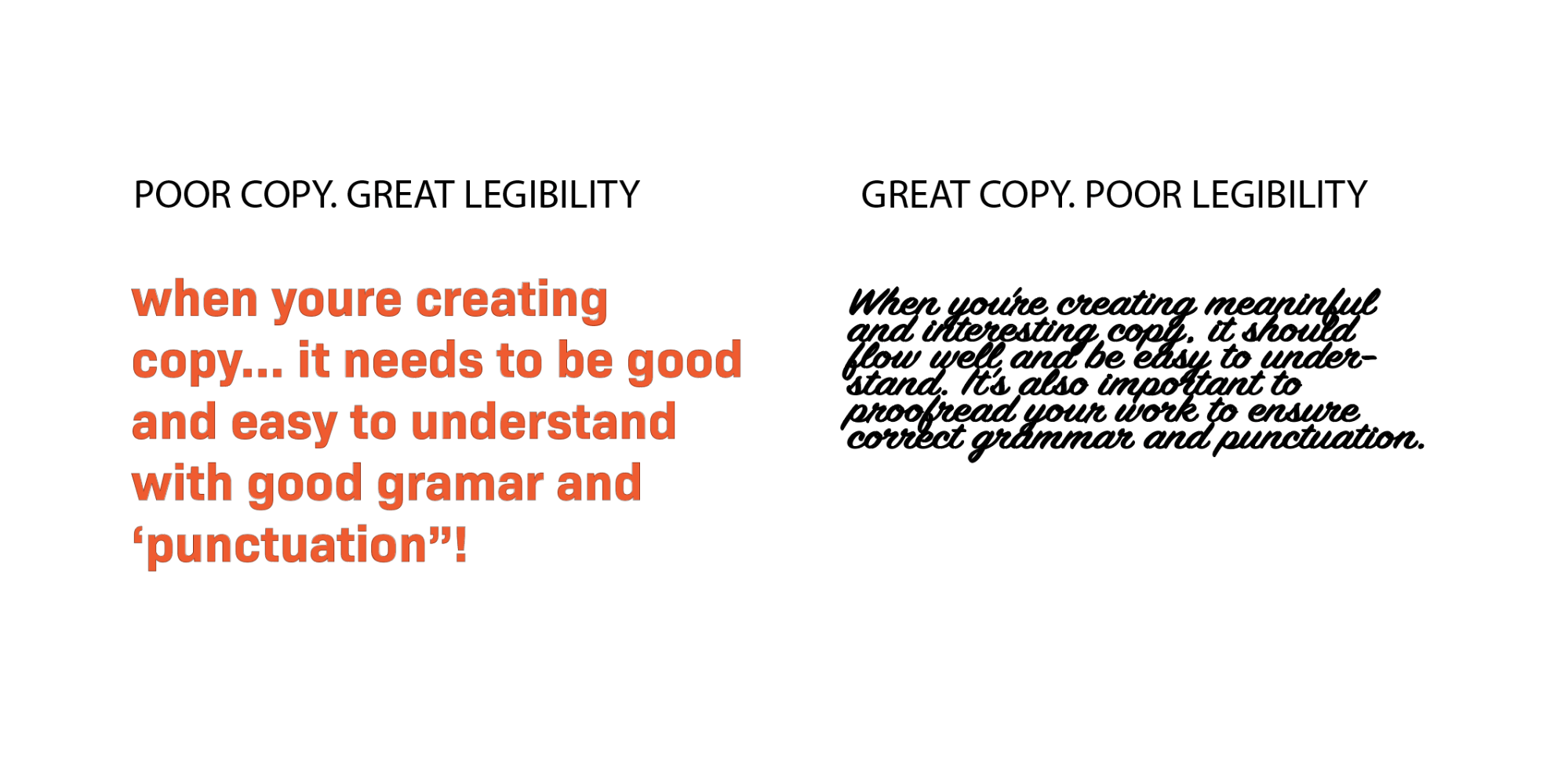
Font selection is another critical factor in rhythm calibration. Serif and sans-serif fonts offer distinct visual weights and character shapes that influence how the eye moves across a page. Serif fonts, with their subtle stroke embellishments, can help guide the reader along the baseline, creating a natural horizontal rhythm that facilitates continuous reading in print or long-form digital content. Sans-serif fonts, with their clean and uniform strokes, often excel in digital environments where high-resolution screens or varying text sizes demand clarity and consistency. Combining typefaces requires careful attention to contrast and harmony; excessive variation in weight or style can disrupt the reading cadence, while thoughtful pairings can enhance both aesthetic appeal and legibility.
Kerning and tracking adjustments further refine typography rhythm. Kerning, the space between individual letter pairs, and tracking, the overall spacing across a word or line, contribute to uniformity and readability. Uneven spacing can cause letters to appear crowded or isolated, forcing the eye to slow down or re-read text segments. Consistent tracking ensures that the text maintains a steady visual beat, enhancing the reader’s ability to anticipate and navigate content without unnecessary effort. Rhythm calibration often involves subtle, iterative adjustments, with designers fine-tuning letter and word spacing to achieve a seamless flow that aligns with human perceptual tendencies.
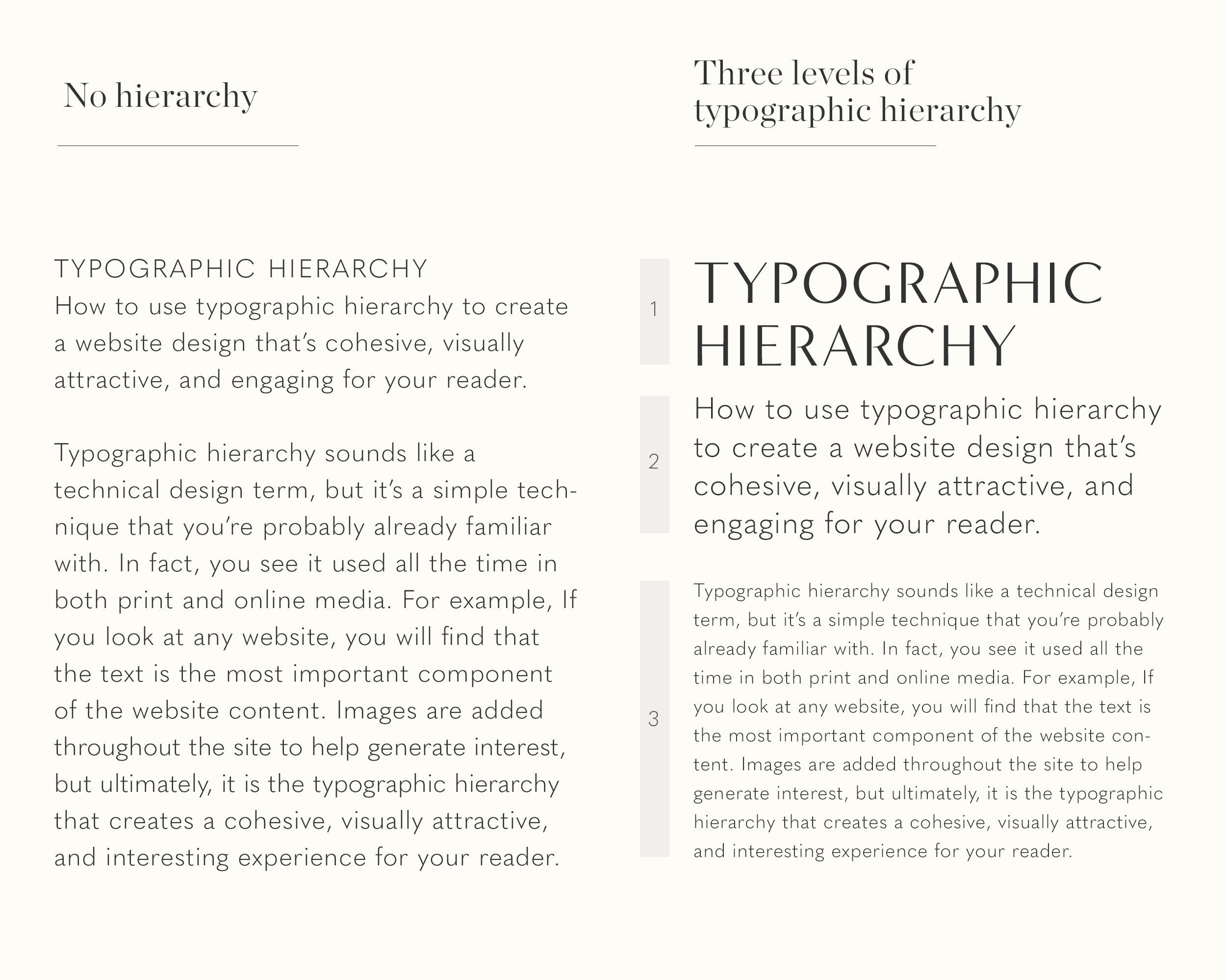
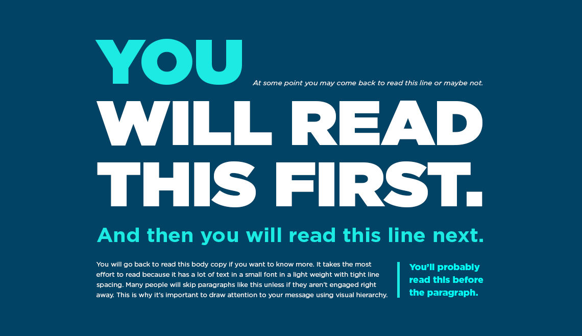
Hierarchy and emphasis are also essential components of rhythm calibration. Bold, italic, and underlined text, as well as typographic scales and color variations, create visual accents that guide the reader’s attention through content in a structured manner. Effective use of hierarchy prevents information overload, allowing readers to prioritize key messages and navigate content intuitively. For example, headings that are proportionally larger than body text establish a clear entry point for sections, while subheadings and bullet points break down dense information into digestible segments. This layered structure not only enhances comprehension but also reinforces the rhythmic cadence of the page, offering moments of pause and acceleration that align with natural reading patterns.
Whitespace, often underestimated in its impact, is integral to rhythm calibration. Properly applied margins, padding, and spacing between paragraphs create breathing room that supports visual hierarchy and reduces cognitive fatigue. Whitespace acts as a buffer, signaling transitions between ideas and allowing the reader’s eye to reset, much like rests in musical notation. Overcrowded text can feel overwhelming, disrupting the rhythm and diminishing readability, whereas thoughtfully distributed whitespace contributes to a harmonious and inviting layout that encourages sustained engagement.
Digital environments introduce additional complexities in rhythm calibration. Responsive design requires typography to adapt fluidly to various screen sizes and orientations, maintaining legibility without compromising rhythm. Scalable units such as ems or rems, flexible grid systems, and dynamic line lengths ensure that text preserves its visual cadence across devices. Interactive content, hyperlinks, and dynamic media further challenge designers to maintain rhythm while integrating functional elements seamlessly. Designers must anticipate user behavior, screen glare, and scrolling patterns, ensuring that the typography remains comfortable for extended reading sessions.
Accessibility is another critical consideration in calibrating typography rhythm. Readers with visual impairments, dyslexia, or cognitive differences may rely on specific typographic cues to decode information efficiently. Adjustable font sizes, high-contrast color schemes, and consistent spacing support diverse reading needs, enhancing inclusivity. Calibrated rhythm minimizes the effort required to read and comprehend content, promoting equitable access to information while respecting the natural reading patterns of all users.
Ultimately, typography rhythm calibration is both an art and a science. It demands a nuanced understanding of human perception, reading behavior, and design principles. Effective calibration balances technical precision with aesthetic sensibility, creating text that is visually appealing and cognitively accessible. By carefully orchestrating type size, spacing, hierarchy, and whitespace, designers can construct a rhythm that resonates with readers, facilitating smooth navigation, improved comprehension, and lasting engagement. In an era where digital and print content compete for attention, mastering typography rhythm is essential for delivering clarity, comfort, and readability in every word presented to an audience.


Leave a Reply